I follow 4 simple steps to design your website...

1. Informal Chat / Initial Quote

I offer a freelance website design and hosting service. The best way to start this process off is with a chat. This will help me understand the scale of the project, what goals you aim to meet and any ideas you have on how to achieve this. This is also a chance to talk through any specific features or integrations you may want and input into the look and feel of the site.  I can also give you an initial quote for the work.


2. Project Requirements / Contract

Following the chat, I will detail the work to be undertaken and confirm any further requirements for the site. This will be presented as a statement of work contract so it is clear what is being delivered, at what cost and by when.


3. Mock Up Design / Review

Once the deliverables are agreed, what works for most clients is for me to produce a mock-up design that gives you a starting point for feedback. From there, the design can be fine tuned and a near finished site can be presented for your review. You can review and request amendments as much as you like. The site is then considered as a 'Final Draft'.


4. Go Live / Submission / Hosting

Once your approval is given to me to proceed from the final draft, the site will be published live. On-Page SEO will be finalised and Search engine submissions completed. If you choose to use my hosting service, I will be on hand to ensure everything is working as expected, email accounts are setup (if required) and you are happy with the completed works.


* For any of the services I offer, I am available to help and assist at any stage to make sure your happy with what is/has been delivered. This is one of the reasons the majority of my customers are through word of mouth referral.

Wirral Website Design

Wirral Website Design
Wirral SEO

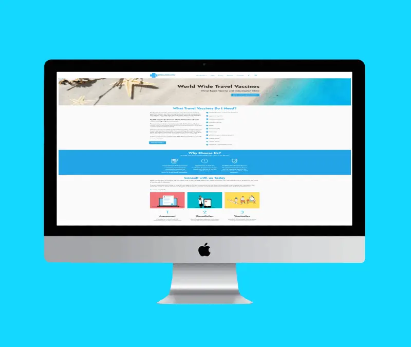
Wirraltravelclinic.co.uk

Wirral Cheshire SEO

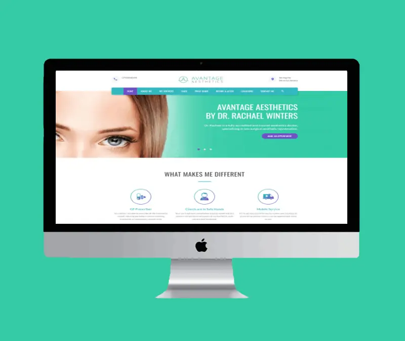
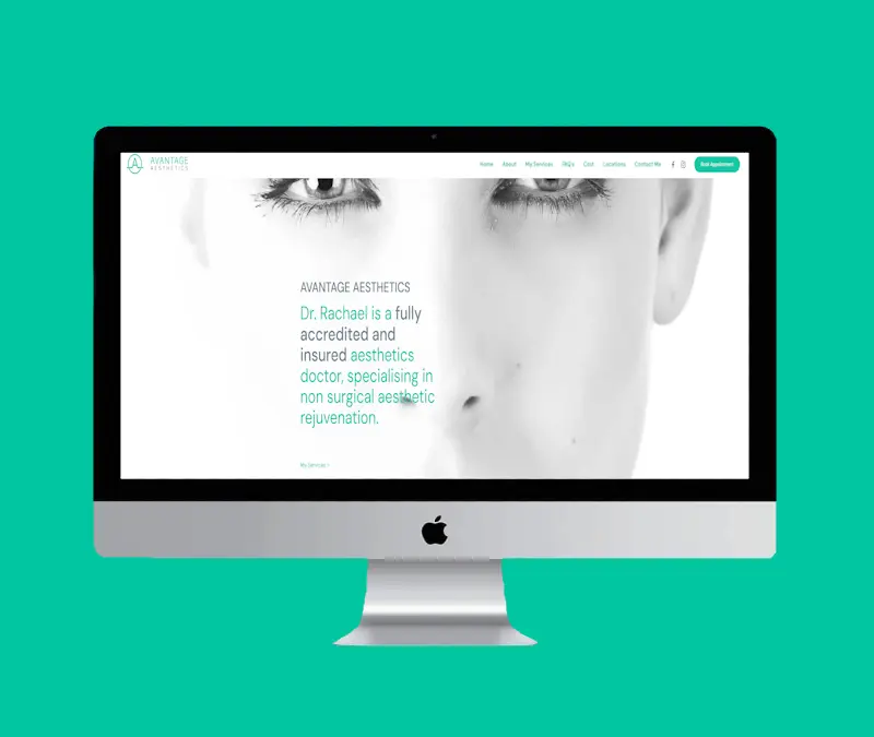
Avantage Aesthetics

Cheap Websites Wirral

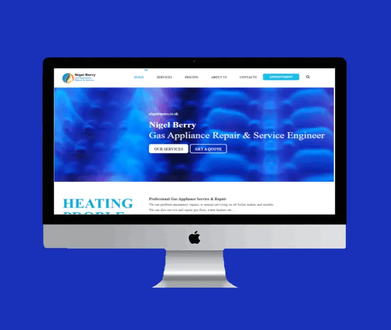
Nbgasrepairs.co.uk

SEO Wirral

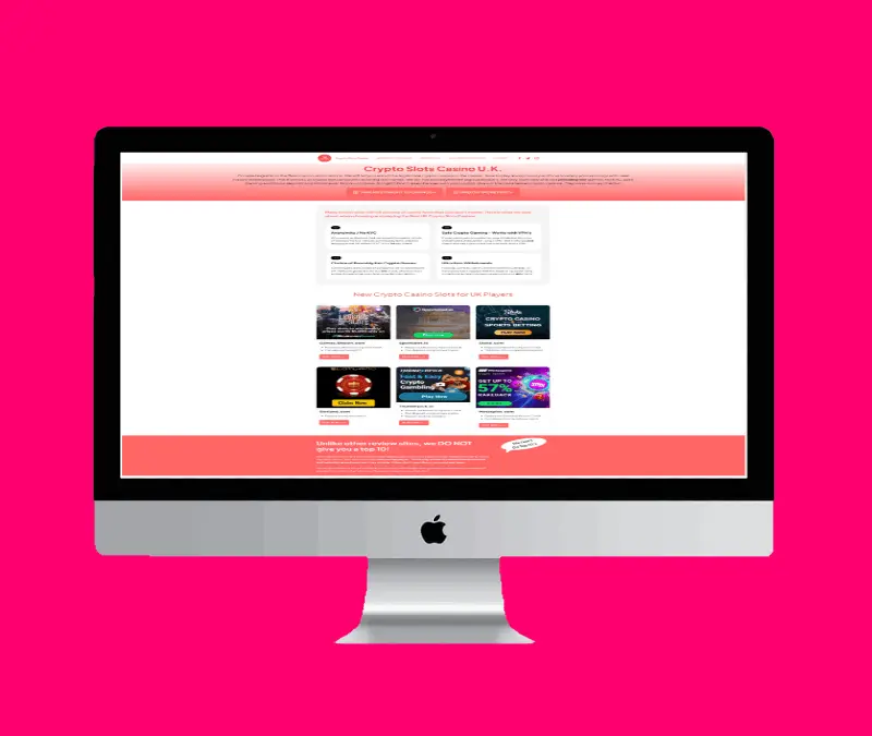
CryptoSlotsCasino

Merseyside SEO Web Design

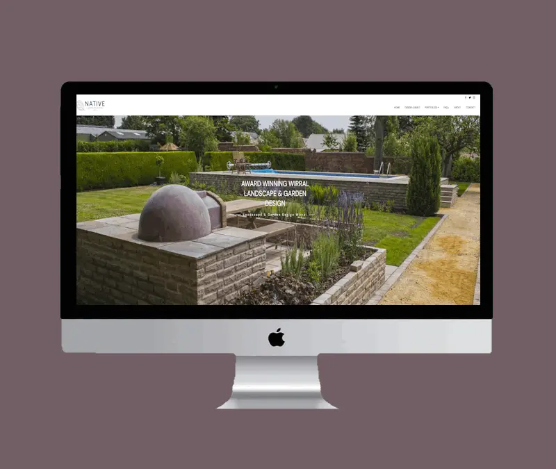
Nativelandscapedesign.co.uk

Wirral SEO

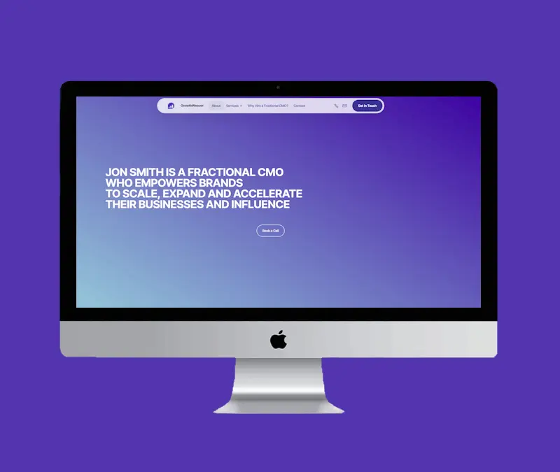
Growthweaver.co.uk

Wirral Cheshire SEO

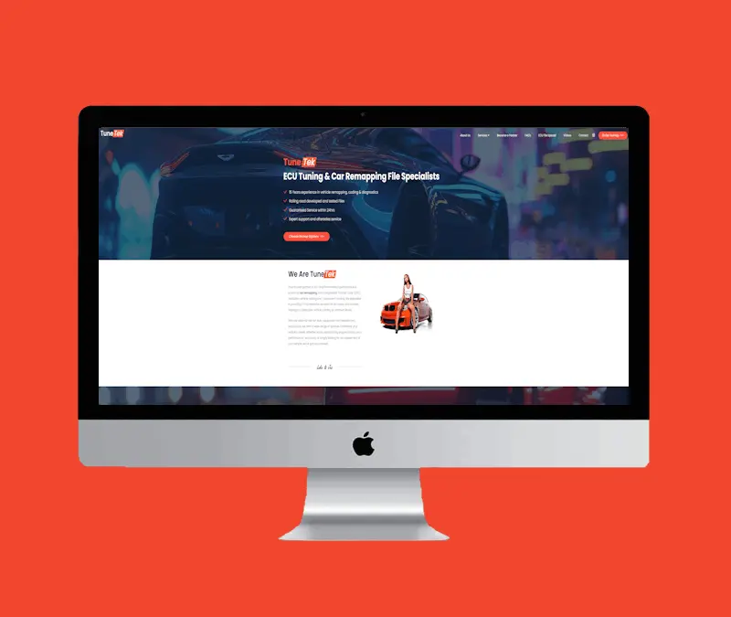
Tunetek.co.uk

Cheap Websites Wirral

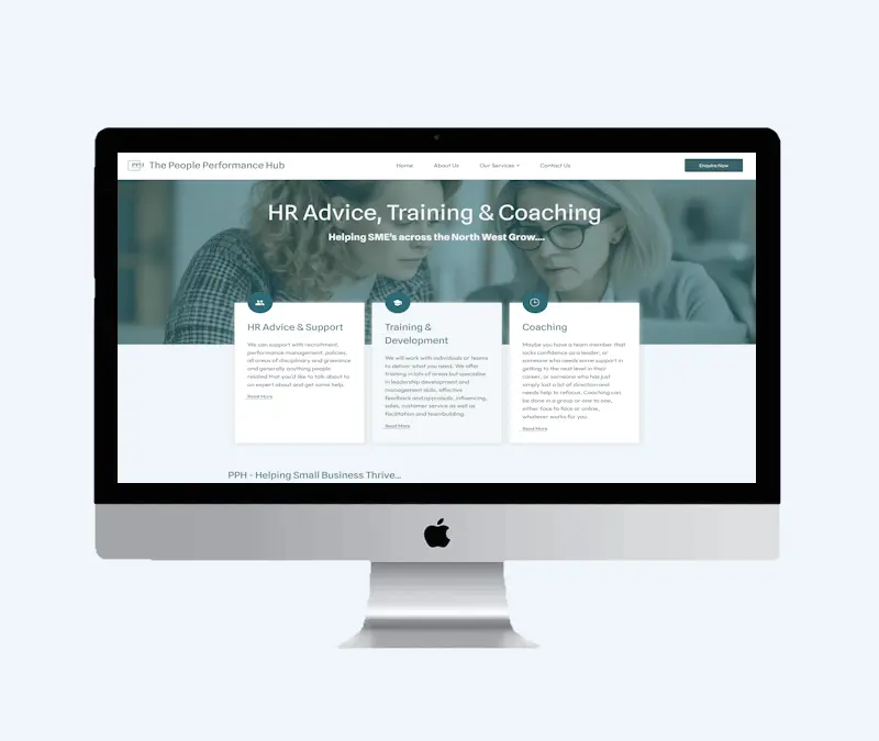
Peopleperfhub.co.uk

SEO Wirral

Skindoctorwirral.co.uk

Merseyside SEO Web Design

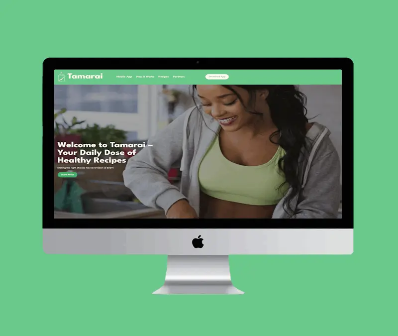
Tamarai.co.uk

Wirral SEO / Wirral & Cheshire Web Design 

SEO Web Design

There are 3 distinctive reasons for starting your SEO journey before you build your website:

Faster search engine ranking and faster growth.

Save time and money by establishing a optimised website foundation.

Let SEO work for you, giving you more time to run all the other aspects of your business.

Freelance Wirral & Cheshire Web Development

Micro-Site Creation

There are 3 distinctive reasons for using micro sites / mini sites as part of your online strategy:

Promoting your primary website through lead generation.

Aggressive targeting of specific products or services.

Dominating the search engine results pages with multiple rankings.

Wirral Website Design

Top 5 reasons for effective website design. Click below to find out more:

Navigation: A well-designed website makes it easy for users to find what they're looking for. Clear navigation menus, breadcrumbs, and search functionality help visitors quickly locate information or products.

Accessibility: Ensuring that all users, including those with disabilities, can easily access and navigate the website is crucial. This involves considerations such as providing alternative text for images, using proper heading structures, and making sure interactive elements are keyboard accessible.

Page Load Speed: Slow-loading pages can frustrate users and lead to high bounce rates. Optimizing images, minimizing HTTP requests, and leveraging browser caching are just a few techniques to improve page load times and enhance user experience.

Content Readability: Content should be organized in a way that's easy to scan and digest. Utilizing clear headings, bullet points, and concise paragraphs makes it easier for users to understand the information presented.

Consistency: Maintaining consistency in design elements such as fonts, colors, and spacing throughout the website helps users feel oriented and familiar with the site's layout, enhancing overall usability.

Branding: Visual elements should align with the brand's identity, conveying its personality, values, and tone. Consistent use of logos, brand colors, and typography reinforces brand recognition and builds trust with visitors.

Imagery: High-quality images and graphics enhance the visual appeal of a website and can evoke emotional responses from users. Thoughtfully chosen visuals that complement the content help engage visitors and keep them interested.

White Space: Proper use of white space (or negative space) helps prevent the website from feeling cluttered and overwhelming. It allows important elements to stand out and improves readability and overall aesthetics.

Typography: Selecting appropriate fonts and typography styles that are easy to read and visually pleasing contributes to a polished and professional design. Consistency in font choices and hierarchy aids in guiding users through the content hierarchy.

Logo Usage: The logo serves as a visual representation of the brand and should be prominently displayed on the website. Consistency in logo placement and size across pages reinforces brand recognition.

Color Palette: A consistent color scheme that aligns with the brand's identity helps create a cohesive and memorable visual experience for visitors. Colors can evoke specific emotions and associations, influencing how users perceive the brand.

Tone and Voice: The language and tone used throughout the website should reflect the brand's personality and values. Whether it's formal and professional or casual and friendly, maintaining a consistent tone helps reinforce brand identity and resonate with the target audience.

Responsive Design: Websites should adapt seamlessly to various screen sizes and devices, including smartphones, tablets, and desktop computers. Responsive design techniques, such as fluid grids and flexible images, ensure that content is displayed optimally across all devices.

Touch-Friendly Interface: Mobile users interact with websites using touch gestures, so it's essential to design elements that are easy to tap, swipe, and scroll. Buttons and links should be adequately sized and spaced to prevent accidental clicks.

Performance Optimization: Mobile users often have slower internet connections, so optimizing website performance is crucial. Techniques like lazy loading images, minifying CSS and JavaScript, and reducing server response times help improve the mobile browsing experience.

Clear Calls-to-Action (CTAs): Effective CTAs prompt users to take specific actions, such as making a purchase, signing up for a newsletter, or contacting the business. They should be prominently displayed, visually appealing, and clearly communicate the desired action.

Strategic Placement: CTAs should be strategically placed throughout the website, taking into account user behavior and the natural flow of content. Placing CTAs where users are most likely to engage with them increases the likelihood of conversion.

Form Optimization: If the website includes forms for lead generation or contact purposes, optimizing them for usability can improve conversion rates. This involves minimizing form fields, providing clear instructions, and utilizing inline validation to prevent errors.

A/B Testing: Continuous testing and optimization of website elements, including CTAs, layouts, and content, can uncover insights into what resonates best with users and drives conversions. A/B testing allows for data-driven decisions to improve conversion rates over time.

U.K. Link Building Specialist

New for 2024! I now offer a Unique UK Link Building Service

0330 043 8966

I am available 8am - 8pm Mon - Sat

info@seo-authority.com

I usually reply within 2 hours

SEO-Authority.com | All Rights Reserved. Copyright © 2008 - 2024